← Back to PortfolioBranding
GreenLeaf
Brand Identity
A complete brand identity for an organic market: logo, colours, typography and packaging.
Project Overview
The Challenge
A new organic market needed a brand that feels fresh, trustworthy and works across packaging, signage and digital.
🎯
Target Audience
Health-conscious shoppers looking for fresh, natural and local produce.
The Goal
What We Set Out To Do
Build a fresh, natural brand that feels trustworthy and organic.
Our Approach
How We Designed It
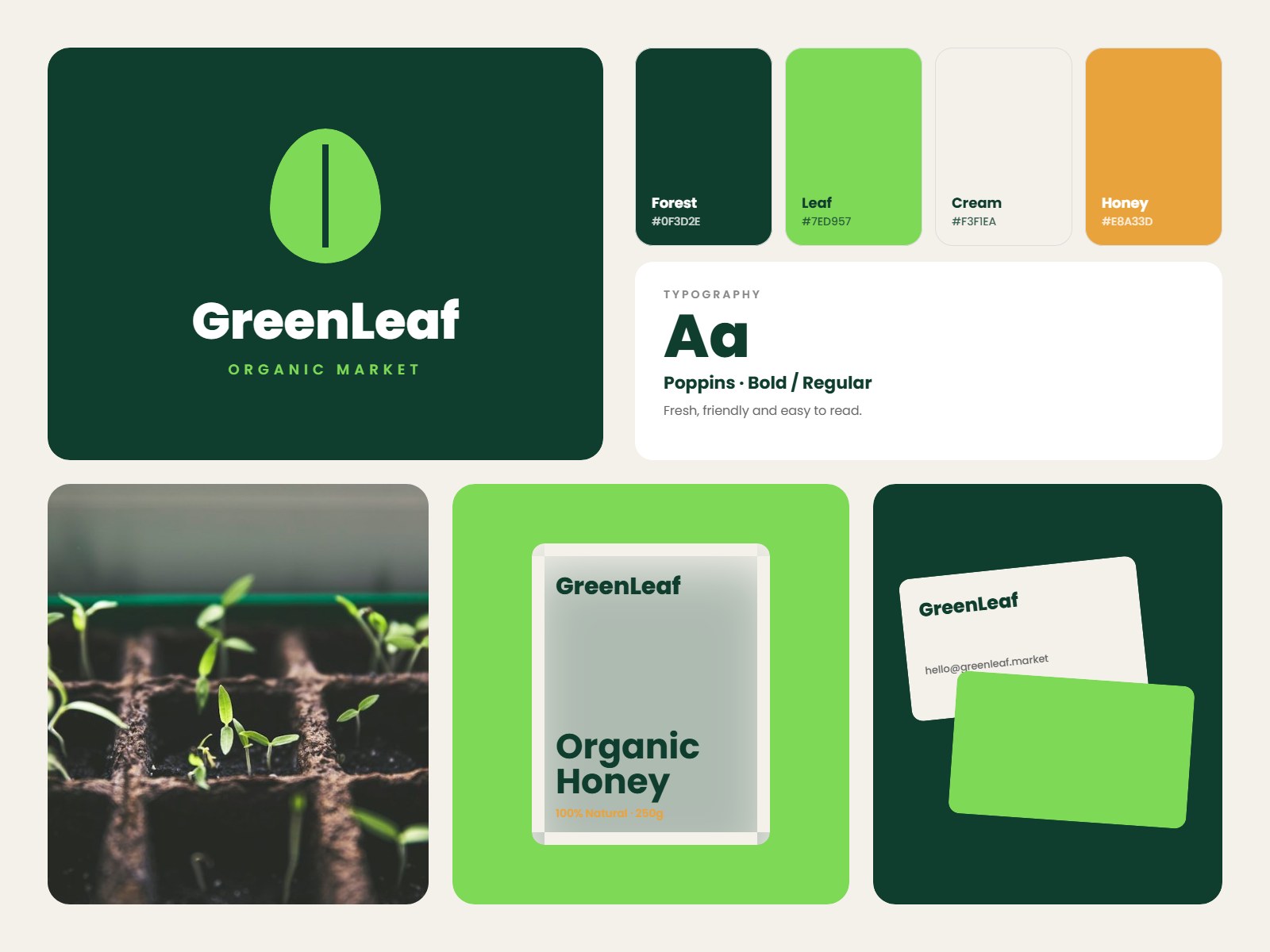
A simple leaf mark, deep forest green and a fresh leaf accent express nature and growth. The system works across signage, packaging and stationery.
Design Process
From Idea To Final Design
01
Discovery
Values, audience and competitors.
02
Concepts
Logo and identity directions.
03
Refinement
Polishing the chosen direction.
04
Brand Kit
Logo files, palette and guidelines.
Our Solution
- Simple leaf mark that works at any size
- Forest green and fresh leaf colour palette
- Friendly Poppins typography
- Packaging and business card applications
Brand Elements
Logo & Brand MarkColour PaletteTypographyPackagingStationery
Key Features
- Logo and brand mark
- Colour palette
- Typography system
- Packaging and stationery
Colour Palette
#0F3D2E
#7ED957
#F3F1EA
#E8A33D
Typography
Poppins
What’s Delivered
- Logo files (PNG, SVG, PDF)
- Colour palette & typography
- Brand guideline document
- Packaging & stationery mockups
Want a project like GreenLeaf?
Tell us about your idea and get a free quote today.