
← Back to PortfolioAds & Print
Brew & Co.
Café Menu Design
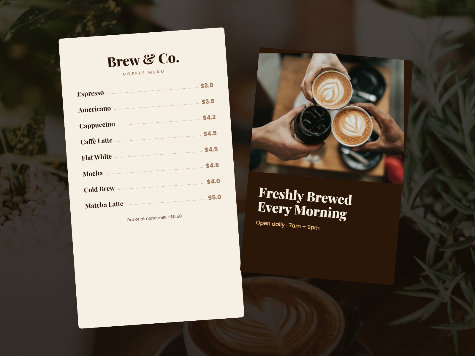
A classic, easy-to-read coffee menu with a matching promotional poster.
Project Overview
The Challenge
A menu must be readable in seconds while matching the cosy café brand.
🎯
Target Audience
Café customers choosing drinks quickly at the counter.
The Goal
What We Set Out To Do
Design a menu that is easy to read at a glance and matches the cosy café atmosphere.
Our Approach
How We Designed It
Cream paper tones, dotted price leaders and elegant serif headings give the menu a timeless café style.
Design Process
From Idea To Final Design
01
Brief
Purpose, size and brand style.
02
Concepts
Layout and typography options.
03
Design
Final artwork and details.
04
Print Files
Print-ready files with bleed.
Our Solution
- Cream paper tone and serif headings
- Dotted leaders for easy price reading
- Add-on note for milk options
- Matching poster for in-store promotion
Designs Created
Coffee MenuPromotional Poster
Key Features
- Print-ready coffee menu
- Matching poster design
- Clear price layout
- Brand-consistent styling
Colour Palette
#2B1708
#A0785A
#F6EFE4
#F5C27A
Typography
Playfair Display + Poppins
What’s Delivered
- Print-ready PDF files
- Editable source files
- Digital versions for social
- Colour and font guide
Want a project like Brew & Co.?
Tell us about your idea and get a free quote today.